Portfolio
"Dear Design:"
Discovering Data Visualization and Design Awareness
Overview
The "Dear Design" research seminar was a 10 week course on design awareness through data visualization. As the first research experience I had in HCDE, this seminar transformed the way I understood data visualization.
From Week 2 to Week 10, students created postcard visualizations capturing their design process. This involved 4 steps:
-
What data to capture?
-
How to capture the data?
-
How to interpret the data?
-
How to represent the data?


Postcard Gallery
Jump down to view each postcard!
The value of data visualization
Through these visualizations, I learned so much about my own design process. As I captured, interpreted, and represented the steps in my design process, I saw how I often take a step back to look at the bigger picture and find new ideas, and how I value doing work that is personally meaningful.
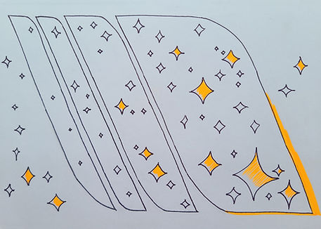
You can see it captured in my final postcard for Week 9. The spaces in between the vertical layers represent the pause-and-reflect moments where I find new inspiration, and the increasing amount of orange stars represent me incorporating more and more personal meaning into the design process.
The beauty of data visualization
Developing a good visualization is hard. I learned that in order to tell a compelling story, the data has to be presented factually, yet also with visual flair---and it's a tough balancing act!
Over time, my postcard visualizations moved from being data-centric to being artistic and ambiguous. This shift reflected my improved understanding of my design processes: once I had the basic understanding nailed down, I could play around with the data and be more creative.
My Aspirational Design Signature
The ninth postcard in the gallery above (and the ninth postcard below) is my Aspirational Design Signature. This visualization focuses on how I incorporate personal meaning and project meaning within the design process.
It's structured around the "ideal project envelope" design process model, which was developed by the UW Center for Engineering Learning & Teaching. The four leaf-shaped sections represent flow periods, and the separations between them represent the importance of taking breaks. These sections are visually modeled after the ideal project envelope because I could move through multiple design stages even in a single flow session.
As time progresses, I enter longer periods of flow, and I begin to build in the space to add more personal meaning in the project, in the form of orange stars. Some stars remain outside, showing that there's always some meaning that isn't incorporated, and that's okay---our work isn't perfect!
Week 1 - Retrospective Capture


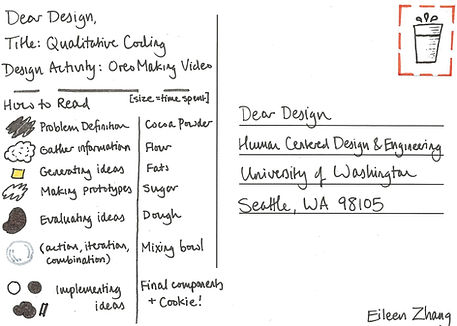
Week 2 - Qualitative Coding

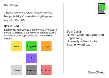
Week 3 - Concurrent Capture

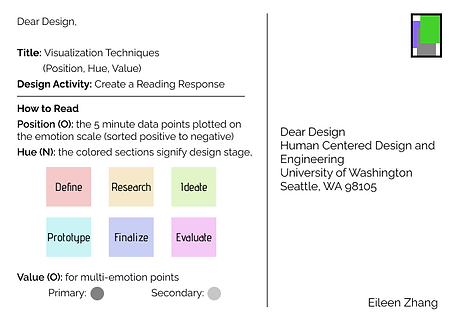
Week 4 - Visualization Techniques

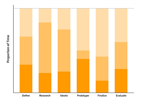
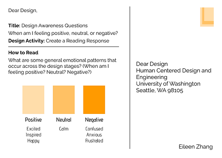
Week 5 - Design Awareness Questions
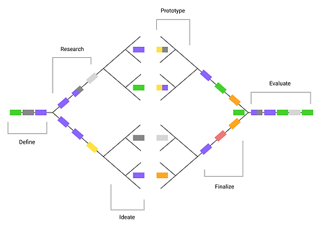
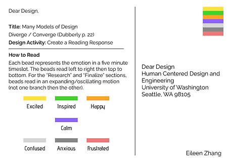
Week 6 - Many Models of Design
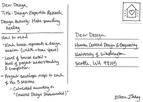
Week 7 - Design Expertise Research

Week 8 - Design Inspirations


Week 9 - Ideal Design Signature