Portfolio
Design Signatures:
Building and Evolving a 500+ Page Design Education Website


Overview
Before

After

Key Outcomes
✓ Progressed from junior designer to sole platform owner managing 500+ pages across multiple programs
✓ Led comprehensive redesign addressing 3 years of accumulated user feedback on navigation and findability
✓ Designed and tested 22 teaching resources used at conferences and cross-institutional workshops
✓ Created scalable information architecture supporting complex CMS collections in Webflow
The Challenge
Technical
Challenge
Mission
How might we transform decades of dense design education research into an engaging, accessible digital experience?
Conveying the critical importance of design awareness in engineering education
Act 1: Foundation (2022)
Information Architecture at Scale
In May 2022, I joined the project during low-fidelity prototyping. I owned the complete IA, evolving it through 3 iterations to support 500+ pages. This required balancing multiple program areas while maintaining clear navigation.
First iteration
Second iteration
Third iteration


Final Information Architecture
(September 2022)

Advocating for Different User Needs
Our two user groups had conflicting needs:
-
Educators: Quick access to curriculum materials
-
Learners: Guidance on design awareness concepts
Coming from a student background, I championed the learner perspective in design decisions.
User Testing Insight
Through 2 rounds of testing (surveys + task observations), I identified a critical finding: users preferred organizing by "topics" rather than "weeks."
"From the student's perspective, [using weeks] would get confusing because topics are more important." — Testing participant
This insight first emerged during task observations, when I noticed participants hesitating when asked about how they might use the website. They thought that “weeks” meant the material must be used in chronological order and may take a significant time commitment. When we changed our wording to “topics”, participants seemed more comfortable thinking about using the website. It lowered the threshold.
"From the student's perspective, [using the word "weeks"] would get confusing because topics are more important and weeks are a suggestion for how to fit it into a schedule."
Implementing on Webflow
Next, we had to transform our high-fidelity Figma prototypes into a live, maintainable website using an unfamiliar platform: Webflow. Webflow's CMS allowed us to create dynamic collections that could scale, which was vital for our website’s multiple interconnected programs.
Soraya and I used project management boards to divide tasks by program area and complexity, holding daily check-ins to troubleshoot Webflow challenges and share solutions as we discovered them.
Finally, knowing the platform would need long-term maintenance, I proactively created comprehensive documentation covering the site hierarchy and CMS structure at the time of launch.
Website Launch (and post-launch reality)
We officially launched the Design Signatures website in mid-September 2022. The platform went live with all four program areas accessible:
-
Dear Design's 10-topic curriculum with 198 interactive postcards
-
Design Signatures App documentation and download
-
Research and resources library
-
About and team information


Launch wasn't the end—it was the beginning of ongoing maintenance and iteration. Within the first month, I was already:
-
Fixing small responsive design bugs users reported
-
Updating content from Dr. Atman's research
-
Adding new teaching activities requested by educators who attended workshops
Soraya transitioned off the project in October 2022, and I became the sole owner of the platform—beginning a 3-year journey of managing, expanding, and eventually transforming the entire site.
Act II: Sole Ownership (2023-2025)
Managing Growth & New Features
Beginning in October 2022, I became the sole designer, managing all maintenance, uploads, and new development. I conducted backend optimization, cleaning up CMS, removing redundant classes, and standardizing our design system and components for better performance.
In Summer 2023, I launched the Teaching Resources section on the website (check out my Teaching Resources case study for a deep dive!)
Act III: Transformation (2025)
Redesign Based on 3 Years of Feedback
The Problem Pattern
Over 3 years, consistent feedback emerged:
"The website is so helpful, but things are buried and hard to find without specific links."
For example, "capture methods" are an important aspect of this educational resource. In order to get to a capture method from the homepage, a user would need to go through 5 clicks!
I had to balance user needs with stakeholder vision. The original design represented years of Dr. Atman's research: changes needed to feel right to her work, not just test well with users. I continuously gathered data (user testing sessions in 2023, conference feedback in 2024, educator surveys) and presented findings in our regular check-ins. By mid-2025, when Dr. Atman began hearing similar feedback from peer professors, we aligned on priorities: it was time for a comprehensive redesign.
What I learned: Sometimes the best advocacy for users is patient, persistent data collection. Building stakeholder buy-in takes time, especially when they're deeply connected to the work.
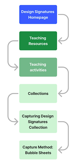
The Solution: Complete IA Overhaul
From October–December 2025, I led a comprehensive redesign of the information architecture. We completely restructured the hierarchy of the website, bringing forward or pushing back content based on what was most effective for educators.
Information Architecture
-
Streamlined hierarchy to surface content faster
-
Reduced clicks-to-content from homepage
-
Eliminated redundancy in navigation
Check out the dramatic change in the information architecture:
Before

After

Revamped Visual Design System
We also decided to change our visual design system: brand, colors, and components.
Visual Design System
-
New accessible color palette (contrast-checked)
-
Cohesive component library across 500+ pages
-
Responsive design system in Webflow CMS
I took initiative of visual rebranding, creating logos and banner images that spoke to the mission. Our previous visual branding was more abstract and less consistent. Our new branding focused on our mission, especially the core concept of the "Ideal Project Envelope" from Dr. Atman's research.
Previous
branding


Inspo

Rebrand

The end of the story: Knowledge Transfer
Knowing I was leaving, I created comprehensive documentation:
-
How-to guides for website management
-
Webflow tutorials for future team members
-
Process documentation for ongoing projects
"You left extremely thorough documentation that no other employee of mine has ever done." — My supervisor
Reflections
What I learned about design at scale:
-
IA requires constant iteration — What works for 50 pages breaks at 500
-
User feedback accumulates — Patterns emerge over time that aren't visible immediately
-
Systems thinking matters — Designing for maintainability and knowledge transfer from day one
Growth as a designer:
Junior designer → Sole platform owner taught me strategic thinking, self-management, and the confidence to make decisions that impact hundreds of users across institutions.